From photography to considering mobile users, web masters have to consider a lot when it comes to a restaurant’s website. We’ve put together a list of key issues any restaurant should consider when creating their website.
Mobile Optimize: Sprites
Many users these days increasingly use their phones to visit restaurant websites. Whether they are on the go or just for convenience, whatever the reason, you want your site to be adapted to cater to mobile users. This means keeping in mind the bandwidth prospective customers are on. Not everyone is on 4G LTE. A mass of users are still on 3G and even 2G network connections . Sprites help your site better adapt to these slower speeds by putting together many small images into one larger image. To make things easier, free online services such as SpriteMe are devoting to putting sprites together for you.
Photography
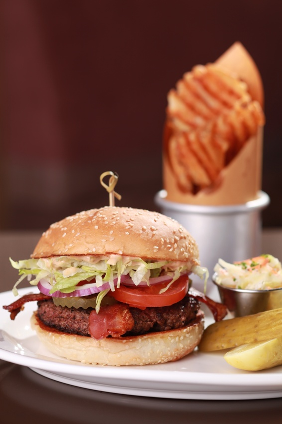
A picture is worth a thousand words. It sounds cliche to make the claim, but photography is tantamount in attracting customers. When people visit your website they are probably interested in food. Poor photography of your dishes can portray the restaurant in a bad light and drive them away. However, with correctly taken photos you can make a customer’s mouth water. It provides the opportunity to immediately show off your most attractive or well known dishes without having to hope the user reads the menu all the way through.
Simplicity
Studies have found users only read about 28 percent of words on an average visit. So keep it simple and concise when putting up content on a page. Allow your pictures to speak and do the work for you.
No Add Ons
Adding flash is a no. Music on your site? No. These add ons annoy users. Your site isn’t made unique because most users have experienced flash animation before, and music on your site won’t be the factor that makes or breaks a potential customer from visiting your establishment. These characteristics of sites simply annoy users and make mobile browsing all the more difficult.
Delivery
A restaurant serves as the best example for the information potential customers want delivered. Whether this is looked up on a mobile device or at a home computer, the key information should be available immediately to a user. For restaurants this consists of the menu, hours, location, contact information, how to make reservations, and special offers. Don’t make users have to hunt and look through several pages to get to this information.
Custom Online Menus
If you think scans or basic PDF files are acceptable, think again. This involves looking at poor or unclear uploads of the menu or downloading files that contain the menu. Other times the entire menu is uploaded, requiring zooming in and out to see dishes. Not only do some people dislike having to download something off a site just to see a menu, many can’t (i.e. mobile users).There are viable alternatives for creating web menus. You can break it into categories, such as breakfast, lunch and dinner. Restaurants sometimes do this to display particular items available at different times. Another option is formatting it to look like a print menu while still using live text and formatting it for the page. A rule of thumb for restaurant web designers is considering if you uploaded something or a copy of your original menu, or did you start again from scratch.
Kids are no exception. If you have a kids menu or section, make it readily available online. Parents with young children are looking for a place to have a meal as a family, so let them know your restaurant caters to both adults’ and children’s pallets.
Andriana Borges is the manager of Estancia Churrascaria, a steakhouse in Austin, Texas. Estancia Churrascaria is a Brazilian steakhouse offering both a 20 item salad bar as well as steakhouse items on skewers ranging from filet mignon wrapped in bacon to ribs cooked to perfection.

