Fonts, how to choose one? Whether it’s for fun or work, you need to decide on a specific font for your writing. There is quite a bit of thought that goes into choosing one.
What to consider when choosing a font
Fonts have changed quite a bit from their rather block origin. Believe it or not, the first printing press was designed to print the Bible, and there was only a single font available in that time.
Later on a number of different fonts were invented for the purpose of appealing to a number of different audiences, and your specific audience is whom you will need to consider first and foremost.
Appeal to different age groups
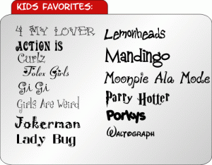
Let’s say that you’re writing for children. You don’t want to use such formal fonts such as Times New Roman, because it can be difficult for children to read and navigate. In addition, children’s books are normally not intended to convey a serious tone. A looser font should be utilized to appeal to children. For instance, many writers choose to use Comic Sans MS in books for ages 8-12.
For younger children a block or casual font may be used, and many publishers will even choose to use the Tahoma font. Remember that larger fonts must be used for younger readers if you are to hold their attention for any length of time. This is not always easy, but with the right fonts it can be achieved!

For older readers Times New Roman, Arial, or Verdana are acceptable. Fonts with simple lines and curvature always come across as professional, to maintain the attention of your adult audience. In many cases you will want to ensure you use smaller fonts. Older readers will have a hard time taking seriously texts of larger fonts. This lack of engagement could lead to disinterest, with the reader not bothering to finish the text. It could be a book, it could be a poster, or it could be a brochure. In any case, you need to ensure that you can capture the reader’s attention. Doing so will help you out quite a bit in the long run.
Choose the right theme
Sometimes you will want to use a font that matches the theme or subject. For instance, if you are were to create a brochure about an old fashioned bed-and-breakfast hotel, it would be a good idea to use Ballentine, Old English or even Victorian. These fonts set the tone as rustic and old fashioned, to help give a sense of the bed-and-breakfast.
Old English could also be used to describe a renaissance fair type event. If you are describing a fantasy event or novel, then Enchantment would most be a more appropriate choice.
Embassy BT, Palace Script MT, or Script MJ Bold go with an elegant and romantic theme when used on wedding invitations.
The right font will display an air of authority. It will show the reader that you know precisely what you’re talking about, and it will ultimately throw them into the right mood for the piece. Remember that font is about more than aesthetics, it is the lifeblood of any document you create.
You may also enjoy viewing Fonts Used In Brand Logos.
