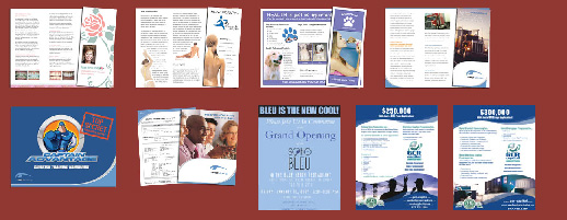
 A brochure is an important marketing tool used by companies all over the United States and the world. It can give valuable information about a company, a company program, plans and goals, or just basic contact information and company information. The idea behind brochure design is to make it so that the client or customer wants to hang onto the brochure. What Most Clients Don’t Know About Graphic Design is that the design should be created in a way that makes it easy for the reader to understand exactly what it is that you are trying to say.
An effective brochure design…
They say that you should create a brochure that makes it hard for the reader to throw the brochure away, but that is what brochures are for. They are made to be dispensable, so in creating a brochure it is your job to make sure that the brochure is created in such a way that the customer can get all of the information that they need before the brochure finally bites the dust.
Here are a few elements of brochure design that stand to increase the effectiveness of the brochure itself.
Make the Text Legible and Reader-Friendly
You don’t ever want to make the reader feel stupid. It’s necessary to cut down on extra words, big words, clichés, and references that people may not understand. If they feel like your brochure is a bit over-their-head they will have no problem tossing it without taking a second glance! You want the brochure to intrigue and inspire them. Get them to read more.
Use Visual Aids to Drive a Point Across
Another thing to do in order to make your brochure more reader friendly is to give the reader visuals to work off of. This is important; most readers do not read but skim the pages and take note of the images and the image captions. If you want your reader to really be able to understand what you are trying to say, use images, graphs, and things of that nature to drive the point home. Select them wisely and try not to overdo it as the more images you use the more brochure paper you are bound to use. This increases the costs associated with producing the brochure, something that you probably don’t want to get into.
Don’t Give Too Much
Don’t give up too much information in your brochure. Leave the customer wanting more! Enough so that they will bring you their business. Leave them wanting more so that they will drop in, call the number, or visit your website. That way you can get them to give you the foot traffic or site traffic that you need. Thus, giving you the opportunity to pitch to them your services and gain them as clientele.
Brochure design sounds like one of those things that should be so complicated, but it is not! There are many different templates to use, but how you use them with your content is up to you. Hopefully these ideas will give you the opportunity to use your content much more effectively.
If you decide you need help to design your company brochure, take a peek at our Graphic Design Portfolio and don’t hesitate to contact us.
You may also enjoy FlowingData.com’s article How the New York Times Designs Their Graphics.
