Web design is an art form that is reliant on technology which makes it very unique. The way that we design websites is based around the devices that will be viewing them, their limitations and their power, and this means that we will often be forced to include or leave out features on that basis. The inclusion of Flash is an interesting example here – with that being a feature that would give designers much more flexibility in terms of design and interactivity, but which has been forced off the web due to it being impossible for Google to index and lack of support from Apple (and now Android) devices.
Generally though, this reliance on technology has led to one very simple artistic direction. Put simple: web design has become more involved and more complex, simply because connections are faster and devices are more powerful.
But the danger is that we end up doing things just because we can whether or not we should. Sometimes less is more from an artist, or a functional standpoint, and restraint is something that should be applauded therefore.
 Examples of Minimalism
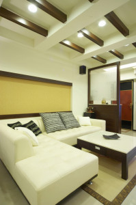
Minimalism is something that can benefit a lot of fields, and which we can find many examples of. In interior design for example, minimalism has become more and more popular, and this is something you can experiment with yourself. Try removing half the things in your living room and displaying only your very favorite items and you’ll see right away that it can make a huge improvement to the feel of your room – its tidiness as well as the impact of each individual item.
Another example is in the ‘art games’ genre of computer games. Look for a game like ‘Don’t Look Back’ and you’ll see how the designer Terry Cavanagh has managed to create a moody atmosphere using only shades of red and silhouettes. This is a strategy that has been used by artists for a long time meanwhile with artists like Monet often painting in just a single color.
Using it in Web Design
So how can you apply this to your web design? Well to take the example of Monet and Don’t Look Back, you can of course try doing more with fewer colors. Choose a color palette before you begin designing your website, and then strictly make sure you only use colors from within that selection. You’ll find it results in a much more cohesive look rather than a splash of color which can be something of an assault on the senses.
Likewise you can use the same approach that you used for your living room. Look at your web design as it currently stands, or your overall web design concept, and then think about which items you could remove from the page without making it confusing for the viewer. Do this and reveal some white space, and you’ll find that the pages that items on the page that remain call more attention to themselves, that the site feels less claustrophobic, and that it loads faster on slower connection.
Linda Phillips is a web designer and started working a couple of years ago. She started her career working for Yarra Web and says that they groom web designers nicely and the experiences she gained there will help her throughout life.
