When it comes to designing a website be it for personal use or for a business, it can sometimes take a while and be quite tricky to get that spark of inspiration. Knowing precisely what you want isn’t completely necessary if you are using a web design team, but if you can engage them in a dialogue about the kind of thing you want, or at least the feel you want to go for, then this can help you a lot to come up with something you will be more likely to be happy with and that will be more likely to promote your business in the way you want it to.
Looking around for inspiration so that you at least get a feel for the kind of thing you want then is a good move to ensure that you and your web designers are on the same page and so that you can help direct your site to become something that will make the right impact on your viewers.
One way to achieve this is to come up with a color palette and a theme for your site, and looking at different eras and periods in history is a great way to accomplish this. This way you can get a great feel for your website, you can get a ready made color scheme that will create certain connotations for your business, and the whole thing will be held together by that chosen period in history.
 Examples of Eras to Draw On
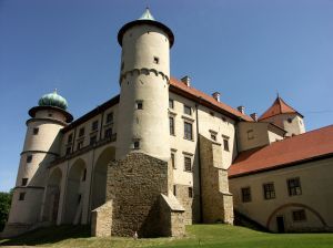
For instance one great era to draw on would be the renaissance period. This is an era associated with great works of literature, with scientific breakthroughs and invention, and with incredible art. This subject matter would gel perfectly with any site about literature, about philosophy, about maths, or that just generally wanted a stylistic look that isn’t seen on every other page on the net. To accomplish this you will use high detail and lots of lines (a stark contrast to the minimalistic designs that we associate with the modern era) and the colors will be made up largely of golds, bronze and black backgrounds.
A similar theme to a renaissance era design would be one that alluded to the industrial revolution, or one that took a bit of artistic license and went for a steampunk look – highly intricate cogs and designs set in bronze and wood to create the look of technological advancement before its time – fitting for many sites and businesses.
Or of course you might want to jump forward a few decades and go for a more colourful and exuberant 60s vibe. This will of course feature vibrant and somewhat garish colors that purposefully clash and lots of circles and flower shapes. This is a site design that will surely stand out and would be ideal for a website that promoted a party planning services, or that listed great cocktail recipes.
And then you might even want to go further forward than that… and even into the future to create the vibe of a website or a business that is ahead of its time, visionary and high tech. Of course it’s harder to source reference material from the future, but a great place to look for inspiration is at science fiction and films that have a very clear vision of the future such as Minority Report or the Matrix.
Looking for particular time periods is just one place to get inspiration for a web design, other great place might be general fiction, interior designs or more. If you can get a ready-made palette and some items of interest from a single source, then this is a great way to get your website ideas to spring to life.
Alexander Shekaroff is a designer who has love for creativity and enjoys experimenting with various techniques in both web designing and development. Check out Alexanders’ work on web designing at the Toronto web design site.
