Is your company or organization interested in a new logo? Are you intimidated by the creative process? Do not fear! MDesign’s Graphic and Logo Design Services makes the process timely and convenient for any client! Getting a new logo is all about taking the appropriate steps of planning and creating. Be sure to read Custom Logo Design Tips for Beginners.
The first step to take is deciding on what type of logo you’d like for your business. Did you know that there are different types of logos? The most common is wordmark, emblem, and combination mark. Let’s discuss the different types in order for you to decide which is the best.
Wordmark
What it is: Wordmarks are logos solely comprised of the brand’s name. This type of logo is similar to the art of typography by its use of line and curvature in text, in order to convey meaning to a viewer. They also are used to complement color in order to express personality. Wordmarks are designed to be bold, to make up for how it lacks graphics.
You may enjoy reading Logo and Branding Inspired By The Print Process.
How to know if it’s for you: Select a wordmark if you desire a brand logo that omits graphics while incorporating typography.
Example:
Emblem
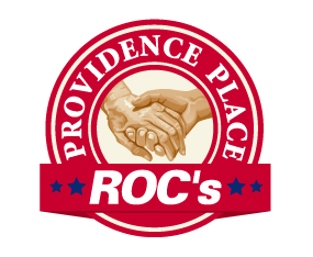
What it is: Emblem logos are icons withheld in contours which derive from geometric shapes. The brand name is designed within the icon. With emblems, there is emphasis more on the imagery and less on the brand name. Graphic designers have to figure out ways to fit the name in a way that does not interfere too much with the image.
How to know if it’s for you: You should consider an emblem for redesigning your logo if you prefer a greater emphasis on an illustration instead of actual text.
Examples:
Combination Mark
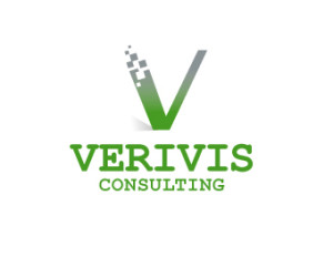
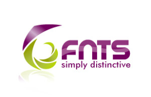
What it is: Combination marks include both a wordmark and either an icon or symbol. Both the icon as well as the word mark are typically sleek and very polished. The intended goal for the logo is that both the icon and the text are so visually bold that, if separated, they independently stand strong. Many brand companies take advantage of its combination mark by splitting up the two components for various products and advertisements.
For example, Nike has a combination mark. Meaning both the wordmark as well as the icon are identifiable on their own when used on various apparel.
How to know if it’s for you: Perhaps you can’t decide whether to get a logo that incorporates imagery, such as an emblem… or one that invokes typography and text, like a wordmark. If you’re unsure about which logo type to pick, then you might enjoy a combination mark. This type allows versatile branding, giving the option to have both icon and word be together or just one of the two.
Example:
Which Logo is Best?
Out of these three, which logo is the best one to get? The answer is all of them!
There really is no logo type that is better than the other. That is because each type serves a different purpose. What is best for a certain company depends on you and your team! Take time to consider what message you would like to convey to potential clients with the use of visual communication in a logo.
Clients of MDesign Media have complete control over the creation of their logo. Our graphic designers cater to your needs through communication so you can have the final say through the creative process!
To begin the process of getting a new logo by MDesign Media, contact us at 813.495.7070 and Request a Free Quote.


